Saltmarsh
A calm, tactile identity for small-batch skincare made from Norfolk salt marsh plants.
The idea
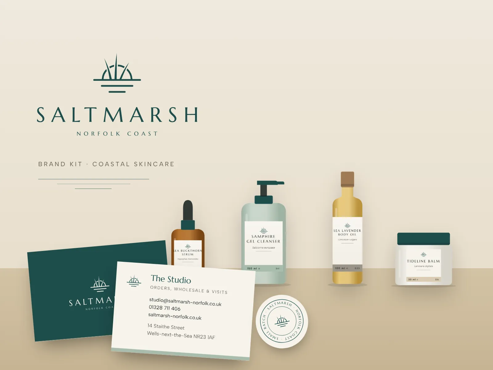
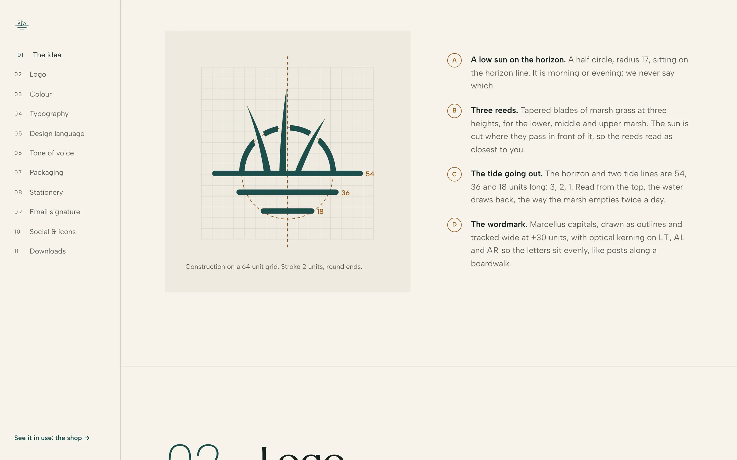
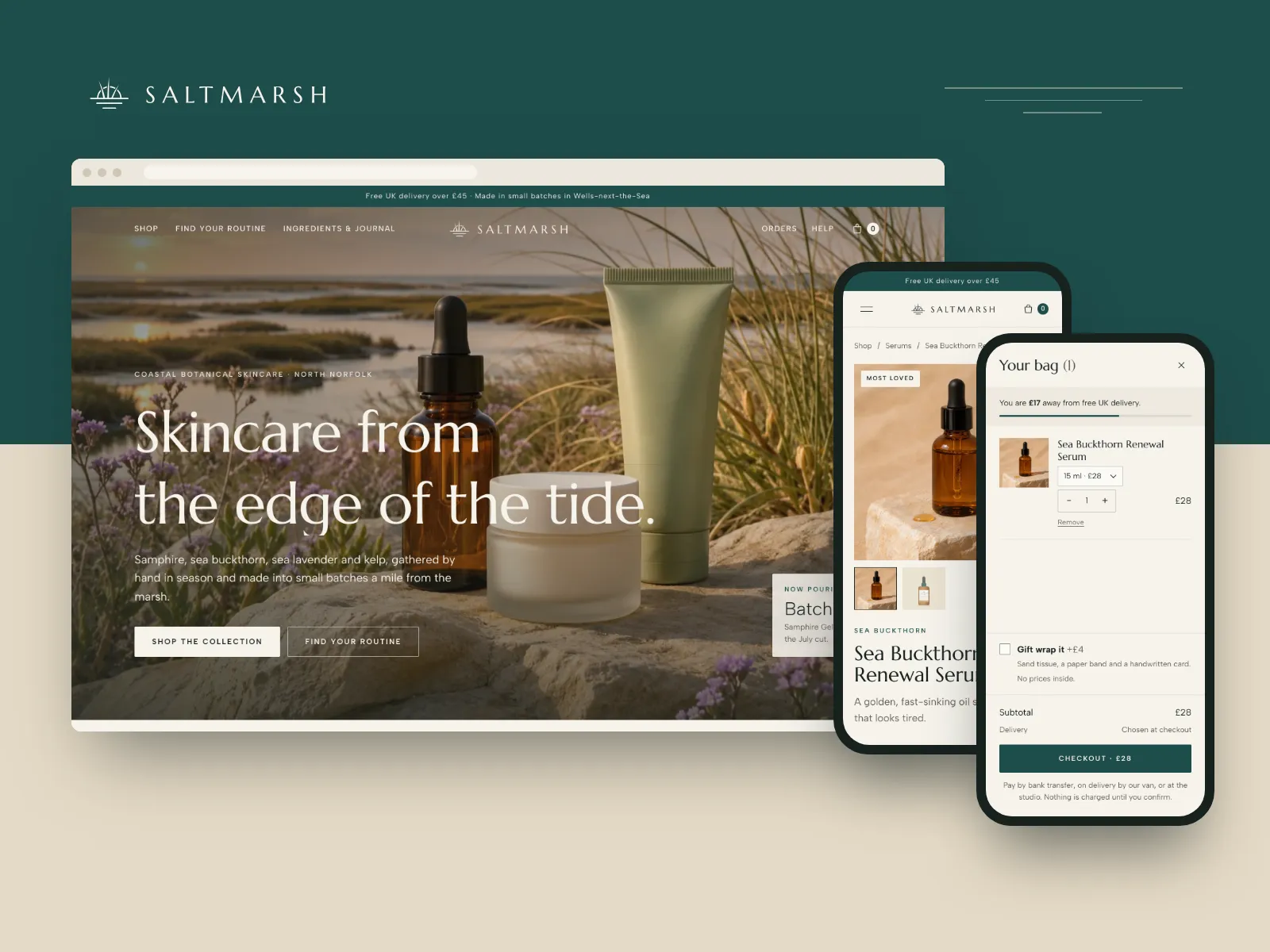
We set ourselves a skincare brand from the North Norfolk coast that could sit on a shelf next to the big names without borrowing their gloss. The mark is a low sun on the horizon with three marsh reeds in front of it and tide lines below in a 3:2:1 ratio, the water drawing back the way the marsh empties twice a day. Colour comes from the marsh at low tide, type is a flared Roman with a plain grotesque, and the same system runs through a full label range for glass, aluminium and paper.
- Product
- Brand Kit, $490
- Industry
- Skincare
- Type
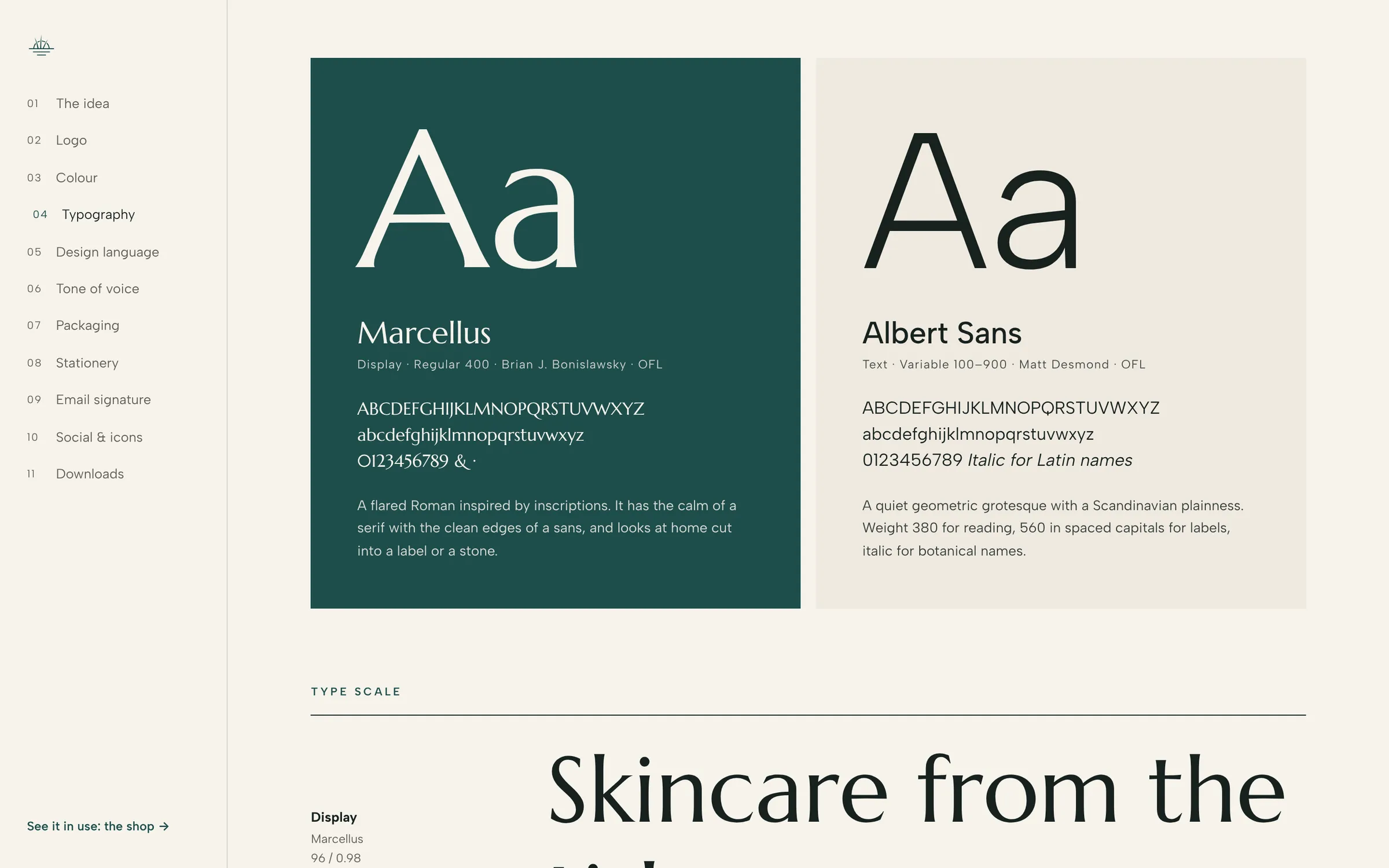
- Marcellus, Albert Sans
- Palette
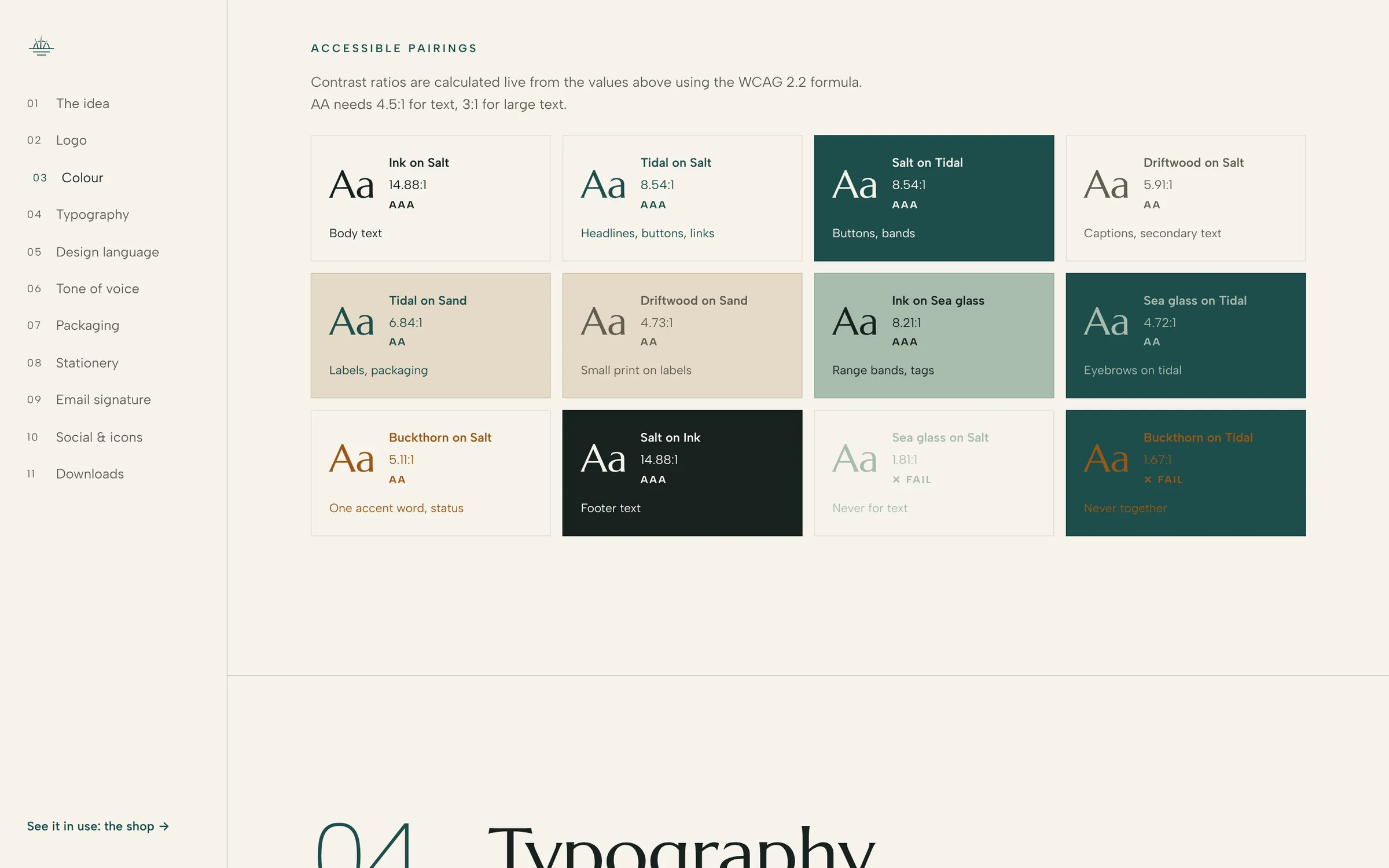
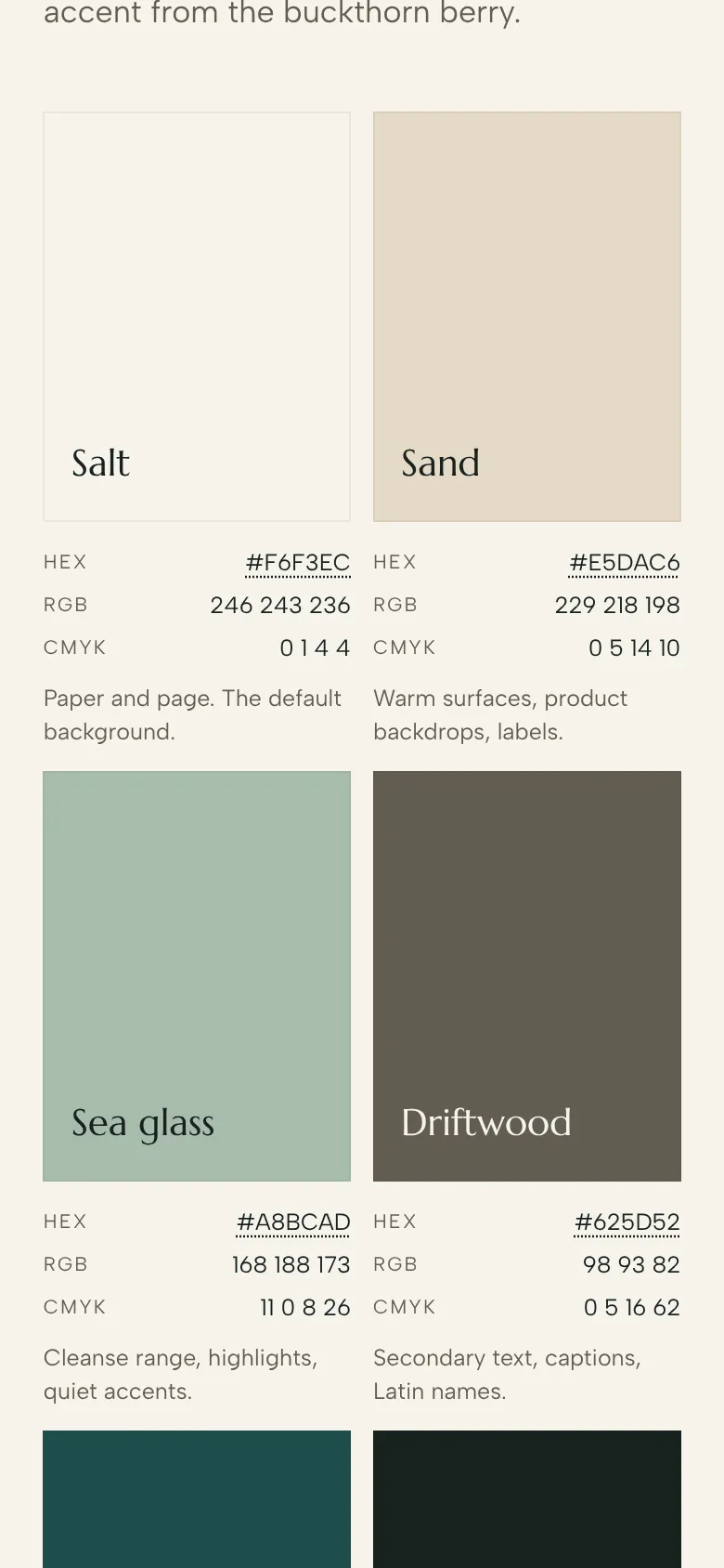
- #F6F3EC#E5DAC6#A8BCAD#625D52#1E4D4B#17211F#985717
- Delivered
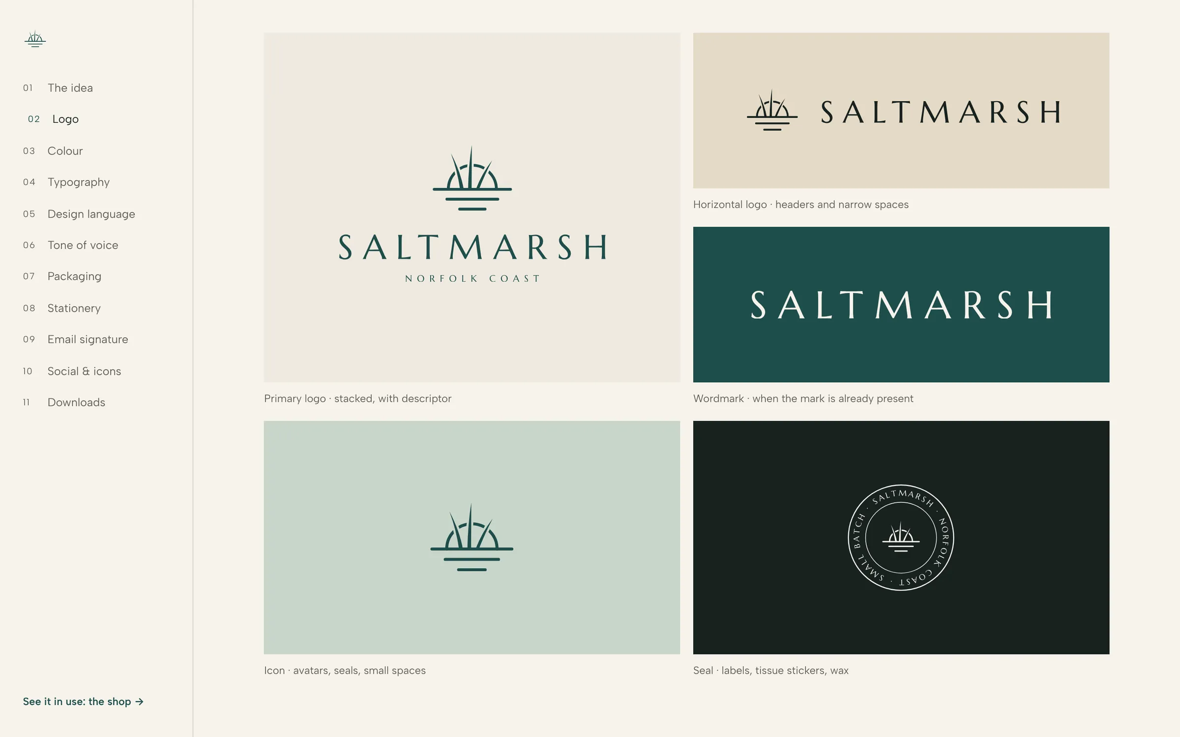
- Mark, stacked primary logo, horizontal logo, wordmark and seal
- One-colour versions, clear space and minimum sizes
- Seven-colour palette, with combinations that are easy to read
- Marcellus and Albert Sans pairing with type scale
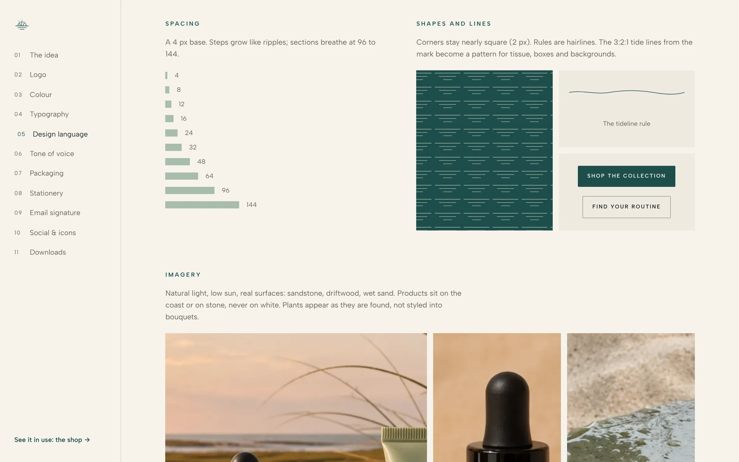
- Design language: spacing, tide line pattern, imagery direction, icon set of 14
- Tone of voice principles with do and don’t lines
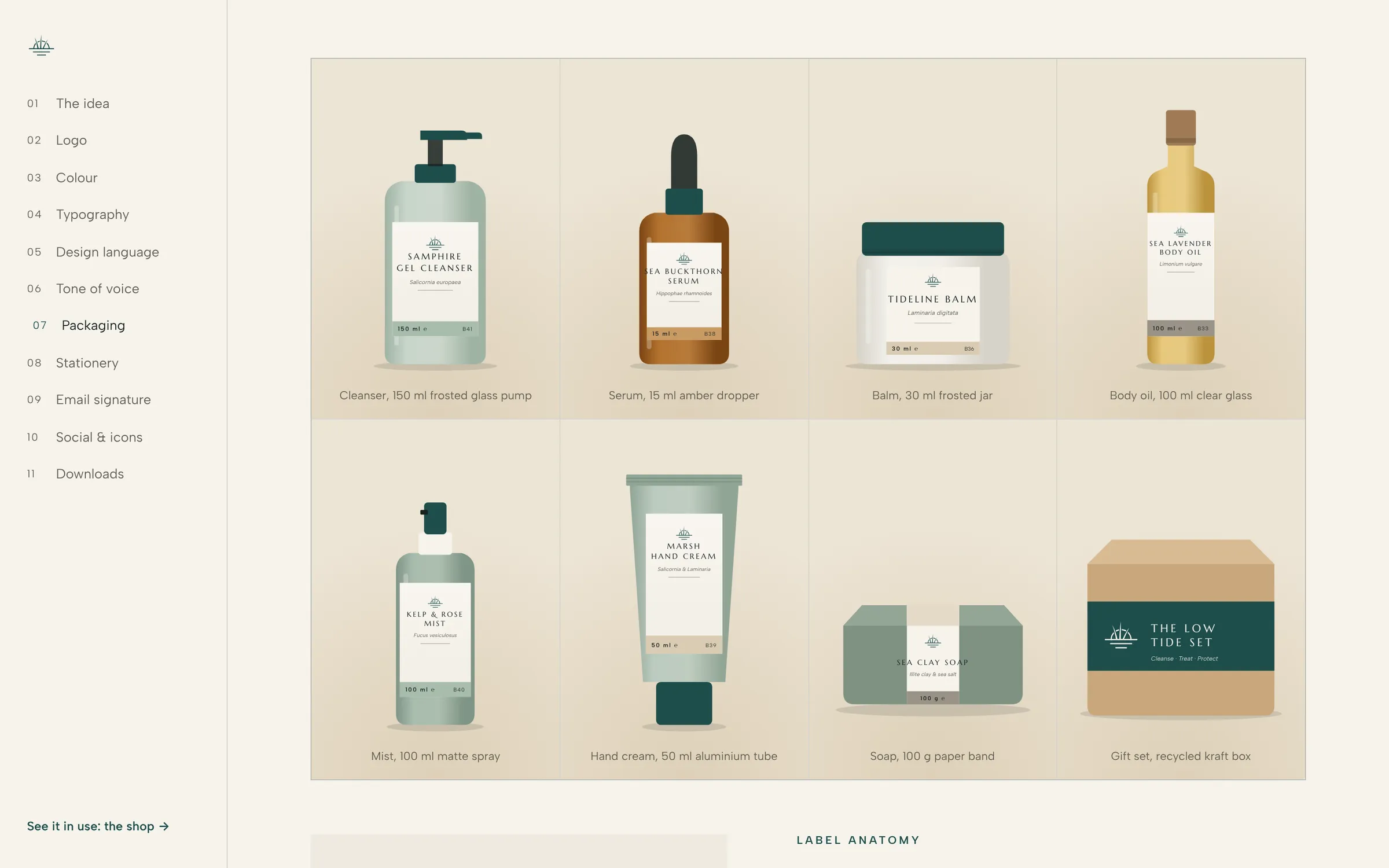
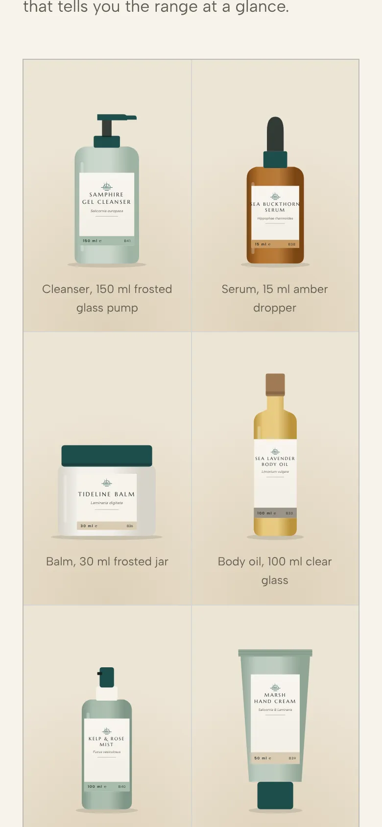
- Packaging label system for eight products
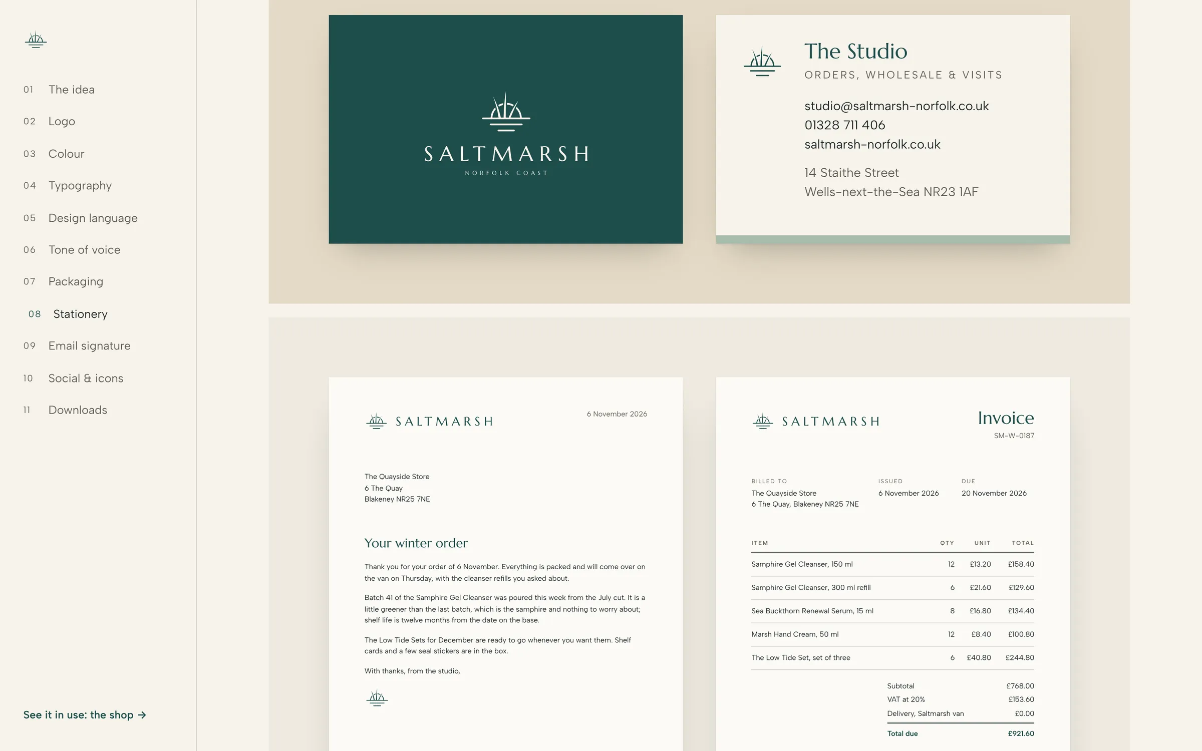
- Business card, letterhead and invoice template
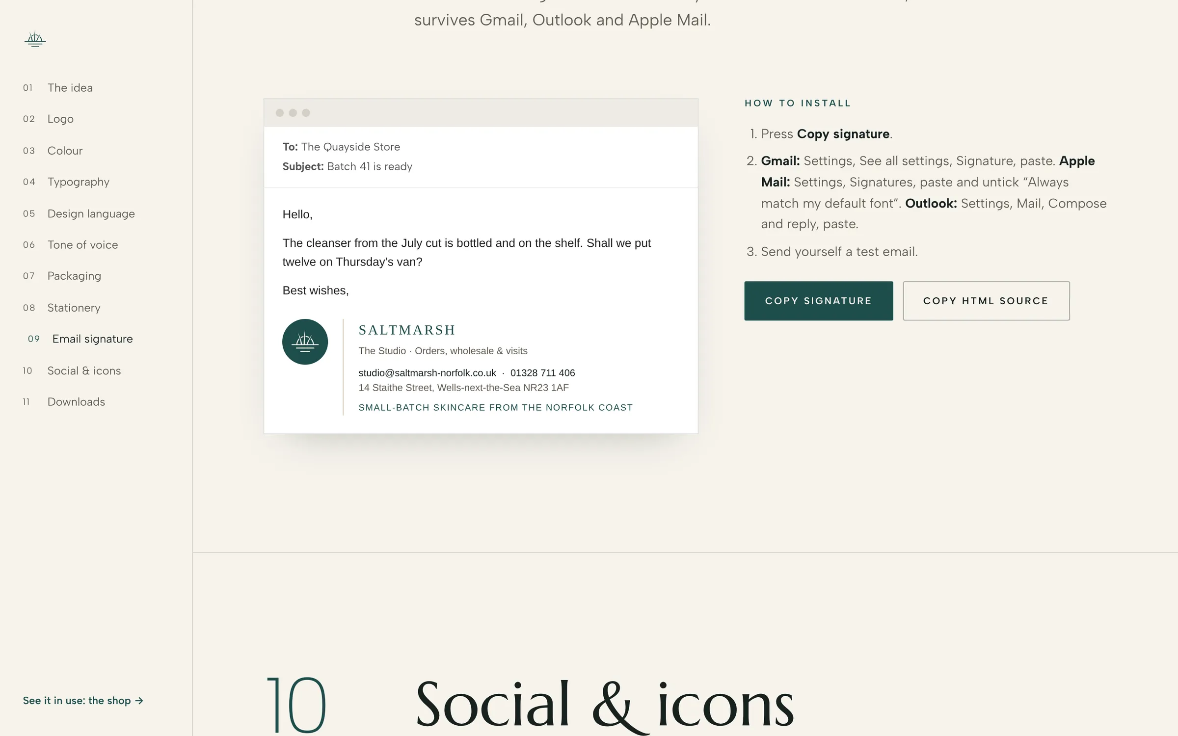
- Email signature, copied in one click
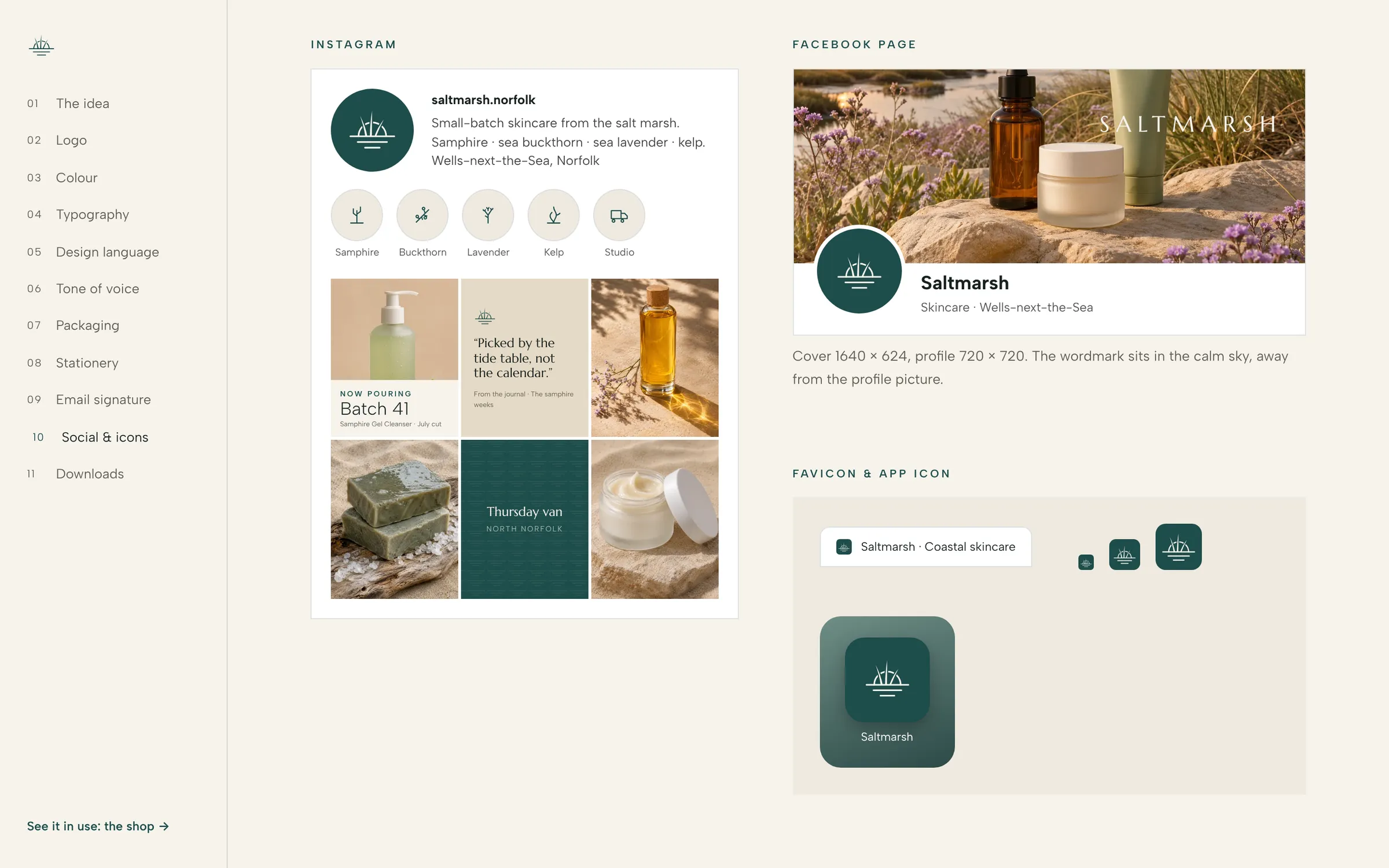
- Instagram and Facebook profile, cover and post templates
- Favicon and app icon
- Every logo file in three colours, in one download
Want one like this?
Brand Kit, $490
A logo and everything that makes it a brand. 5 business days, every step on your own project page.